My Approach to Responsiveness
Published on
31st March 2019
This blog post covers how I use media queries to create responsive websites/application. I feel like a lot of people are familiar with media queries but perhaps get overwhelmed when deciding the breakpoints, since there are all sorts of device screens currently on the market, increasing day by day.
Breakpoints
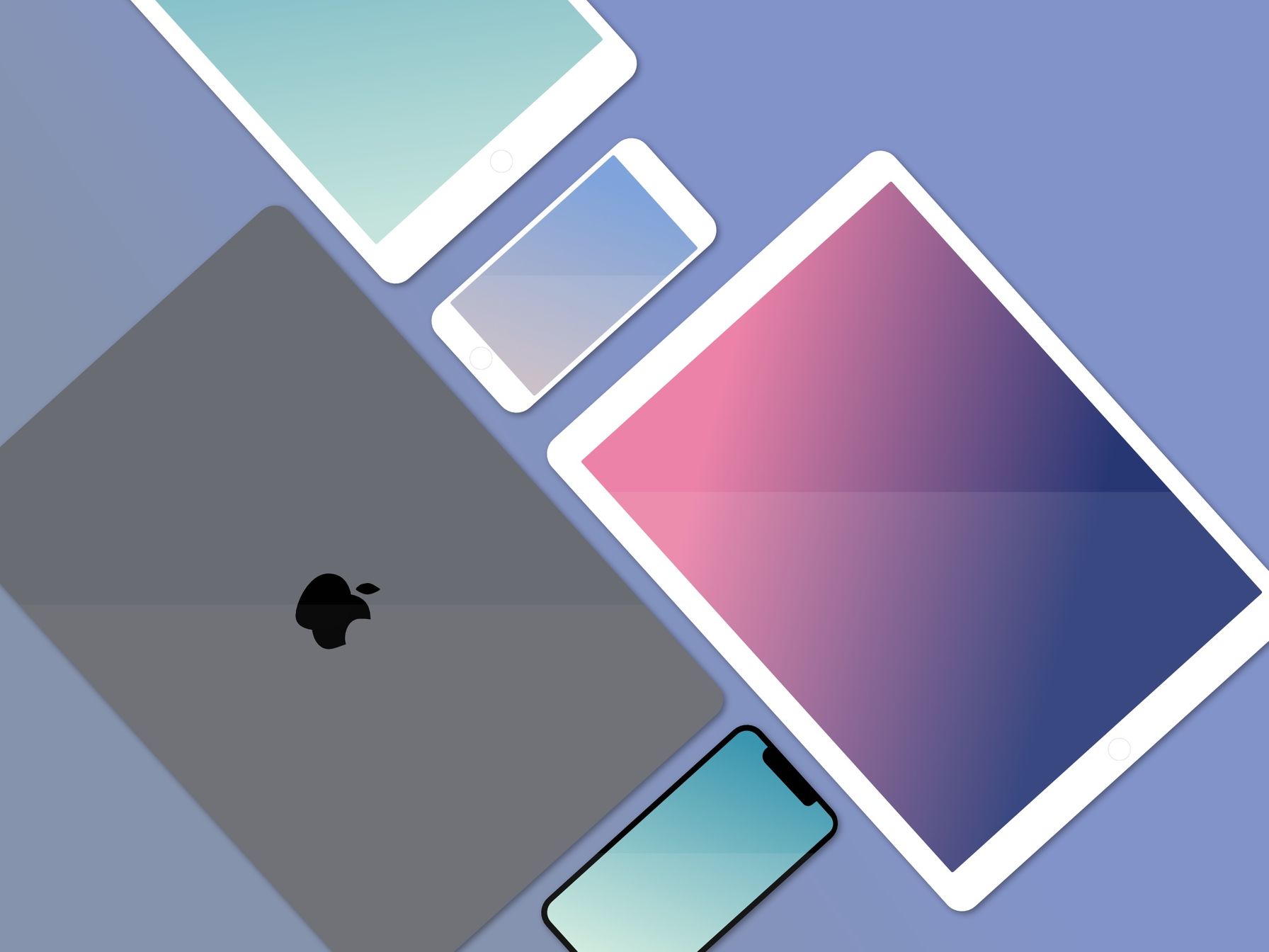
My typical approach when it comes to responsiveness is to target 3 different sized screens: mobile, tablet and desktop. This should work for most use cases on the web as long as it’s implemented correctly.
When the screen size is less than or equal to 600px, we will assume the screen size is mobile. Anything in between 601px and 992px, we will say it is a tablet screen. And of course, anything over 992px will be desktop. It is important to note, these assumptions are not always correct. For example, a large mobile screen in landscape could easily fit into the ‘tablet’ breakpoint. Nevertheless, it doesn’t really matter as we are defining what our design should look like when the screen has X amount of real estate.
Using Media Queries
Typically, if we were to use media queries, we would have to write something like this if we wanted to target the logo class in the tablet breakpoint. It doesn’t look too bad when isolated like this, but can get quite messy on larger projects.
@media (min-width: 601px) and (max-width: 992px){
   .logo {
       width: 150px;
   }
}
Using Media Queries with Sass
Amidst all the buzz around css-in-js, I’m still a big fan of using Sass to write my styles. I use Sass rather than SCSS due to my preference for the cleaner syntax (no brackets, like Python!).
We will use Mixins and Variables, two properties of Sass to make responsive design a breeze (kind of).
Creating the Mixins
Mixins are a feature in Sass that can be likened to functions in normal programming, it allows us to write a block of code that we can reuse. We will create mixins that we will use instead of re-writing media queries, this means that once we have created our mixins, we won’t have to stumble around our code looking for the specific breakpoints required for a tablet screen.
First of all, we’ll create variables that define the maximum breaking point (in pixels) for mobile and tablet. We don’t need to define a variable for desktop, since we can say assume anything greater than the tablet breaking point is desktop.
$tablet-width: 992px // max tablet width
$mobile-width: 600px // max mobile width
We can then use these variables to create our mixins as shown below.
@mixin mobile
  @media (max-width: #{$mobile-width})
    @content

@mixin tablet
  @media (min-width: #{$mobile-width + 1px}) and (max-width: #{$tablet-width})
    @content

@mixin desktop
  @media (min-width: #{$tablet-width + 1px})
    @content
Depending on whether you take a mobile or desktop first approach (or even tablet), you can simply ignore using the mixin for that particular screen and write your base styles aimed for that screen whilst using the mixins to adjust your design for the other screens.
So far, we’ve created mixins that target mobile, tablet and desktop screens. You can of course combine media queries to allow you to specify rules for more than one screen size at a time, helping to reducing code duplication.
@mixin mobile-and-tablet
  @media (max-width: #{$tablet-width})
    @content

@mixin tablet-and-desktop
  @media (min-width: #{$mobile-width + 1px})
    @content
Using the mixins
As you can see in the code below, the mixin approach to media queries is much cleaner than the one we saw with plain CSS earlier in the post.
.logo
	width: 100px
	@include tablet
		width: 150px
	@include desktop
		width: 200px
This is also an example of how you’d use the mixins if you were taking a mobile first approach. As you can see, there’s no need to use the mobile mixin, since our default styles are written for mobile.
Published on
31st March 2019